
Fitted
Helping busy professionals incorporate personalized exercise into their daily routines
Responsive Web App, UI Design
Objective
Inspire people to adopt an exercise routine that fits their level, schedule, and interests.
Context
It might be difficult to find an exercise routine that matches your fitness level, especially if you are looking for something new to try. This responsive web app provides users with a variety of routines, guides, interactive examples, and information to discover something they enjoy.
Additionally, fitting the new routines into one’s schedule can be challenging. The web app is designed to help individuals incorporate physical activities – even as short as 5-minute ones – into their day.
Role
UI Design
Duration
3 months
Skills
Visual Design
Interaction Design
Responsive Design
Wireframing & Prototyping
Define
Understanding the Context of Use - 5 W's
Who?
People who are new to fitness or used to exercise in the past and would like to get back into the routine
What?
A responsive web app letting users search and view routines, guides, daily challenges, and other information on any device, as well as add session times to their calendars
When?
The web app can be used anytime
Where?
On the go, at home, in the park – users can exercise anywhere as long as they are logged in
Why?
To become healthy and enjoy the associated benefits (better mood, weight management, reduced risks of illness, learning something new)
Exercise should be fun and tailored to each user
To save time by fitting exercise into daily routines
Developing User Persona - Rebecca

Next, I crafted User Flows to understand how end users would complete their goals. I sampled User Stories to make the flows as realistic as possible.
User Flows
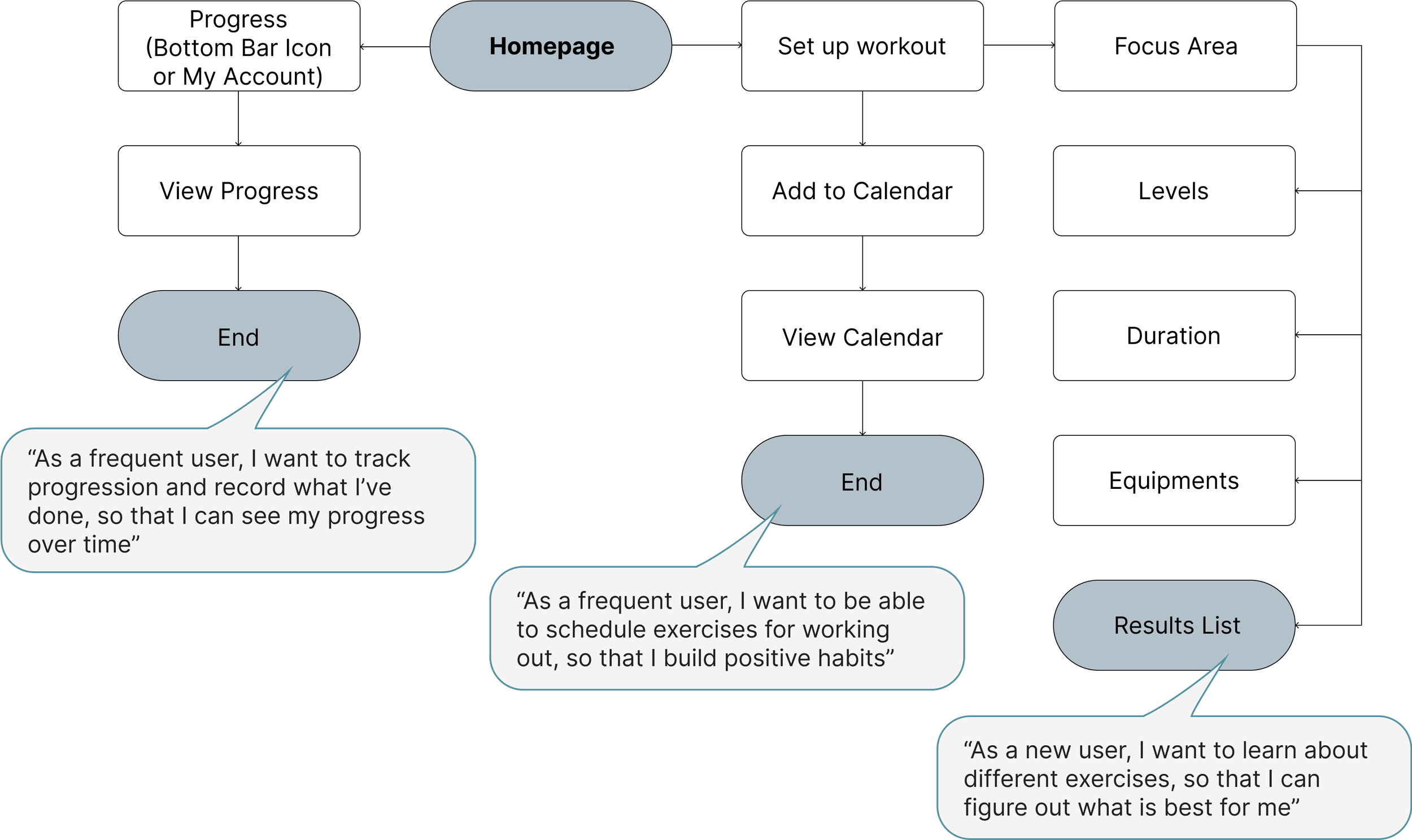
Based on user stories, I sketched my user flow diagrams using pen and paper. Next, I transferred my pen and paper sketches to low-, mid-, and high-fidelity wireframes and organized them into a prototype.

UI & Branding
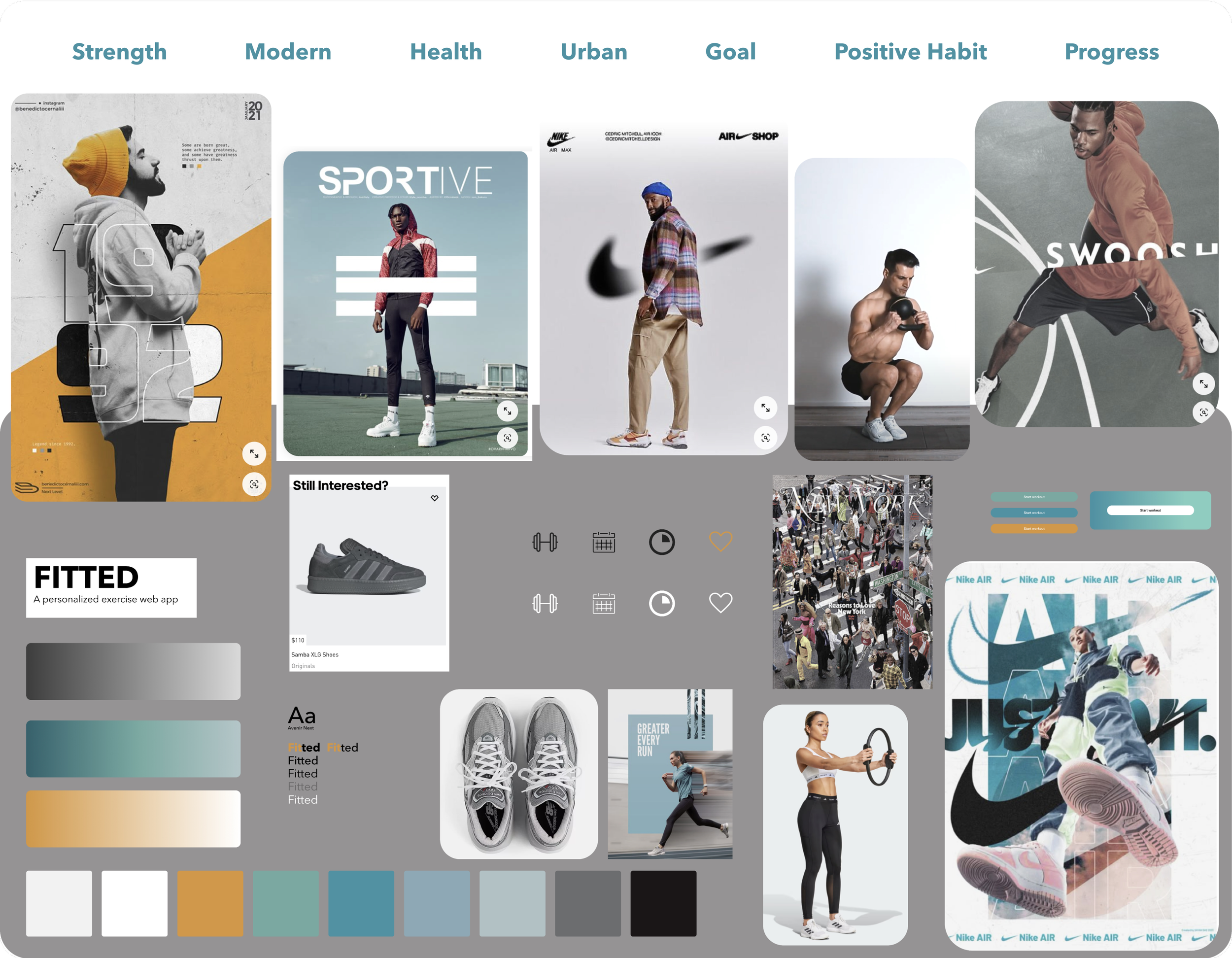
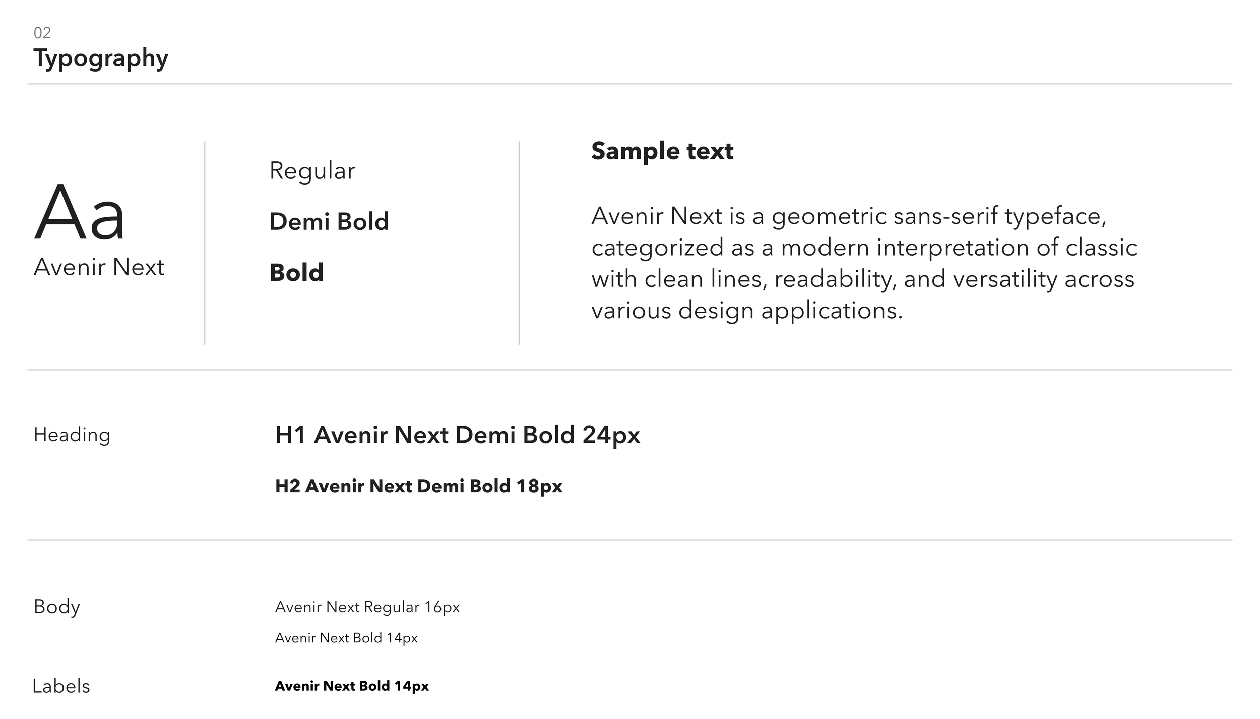
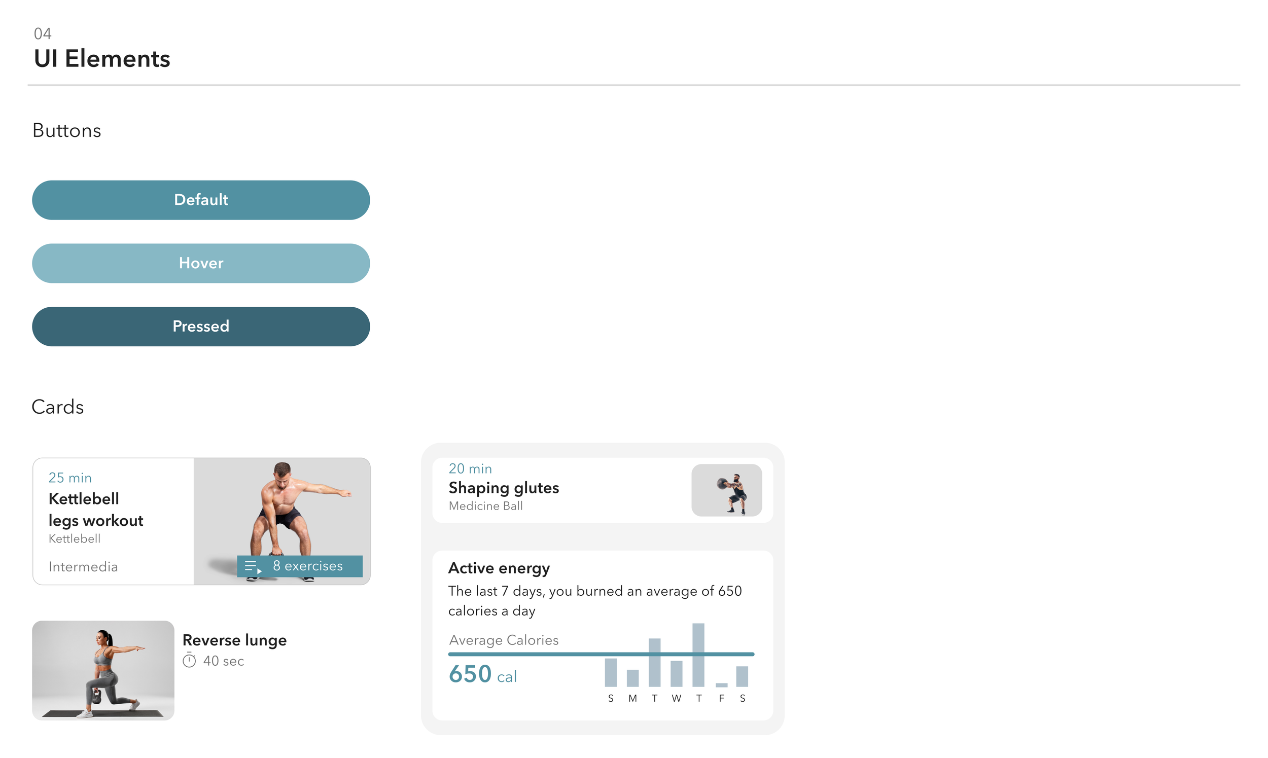
I wanted to make sure the brand reflected the message Fitted aimed to deliver to its audience. I developed some keywords to highlight what Fitted should represent as a brand. These keywords helped me to create a mood board that provided a clear visual direction and justified my design choices.
I chose a calm, neutral color palette to help focus on exercising. The design does not have many distracting details and provides a better emphasis on the app’s content. My goal for the app was to evoke a feeling of a modern, stylish, clean product that conveys the impression of health, strength, and power.
Building The Brand


Final UI


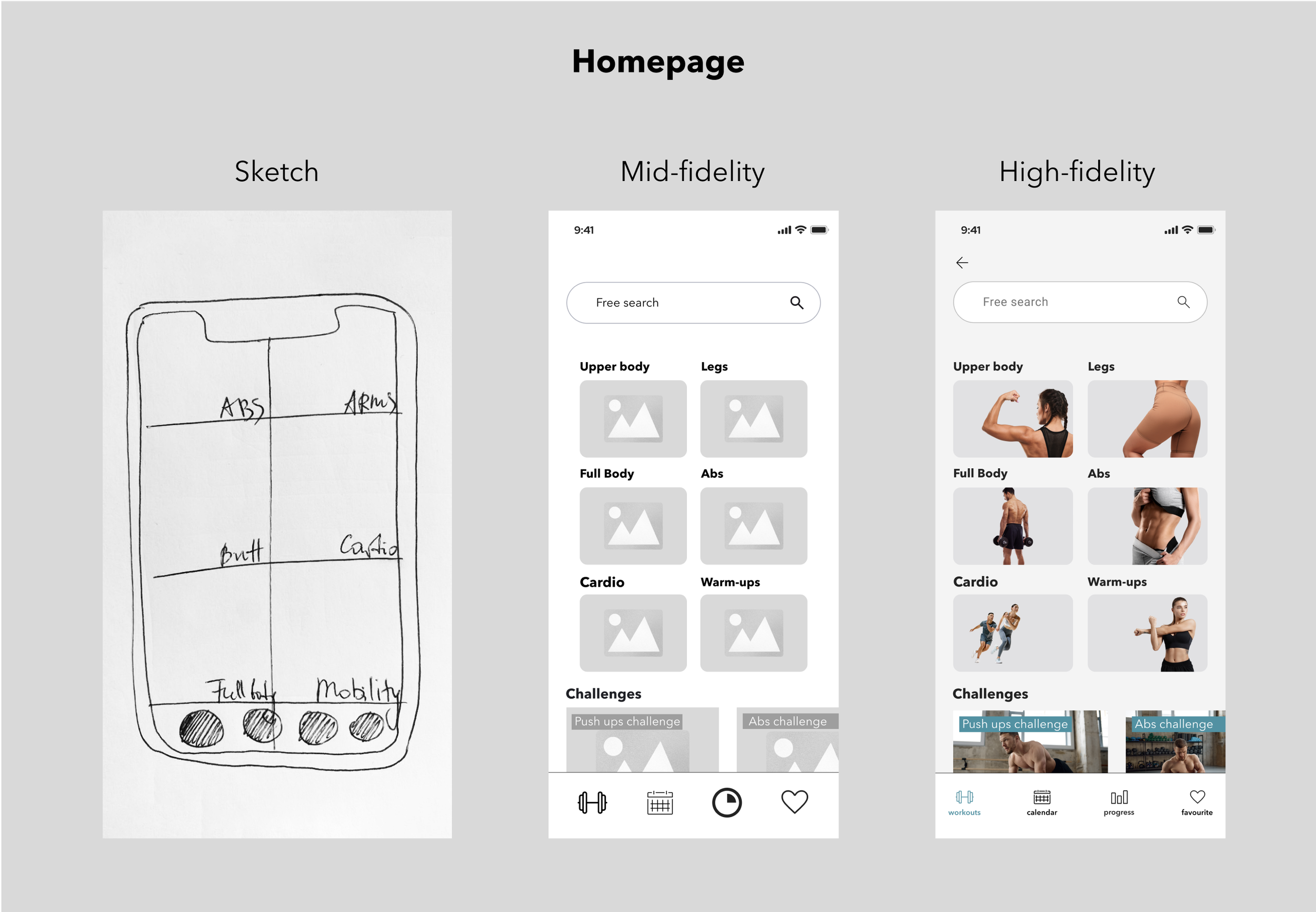
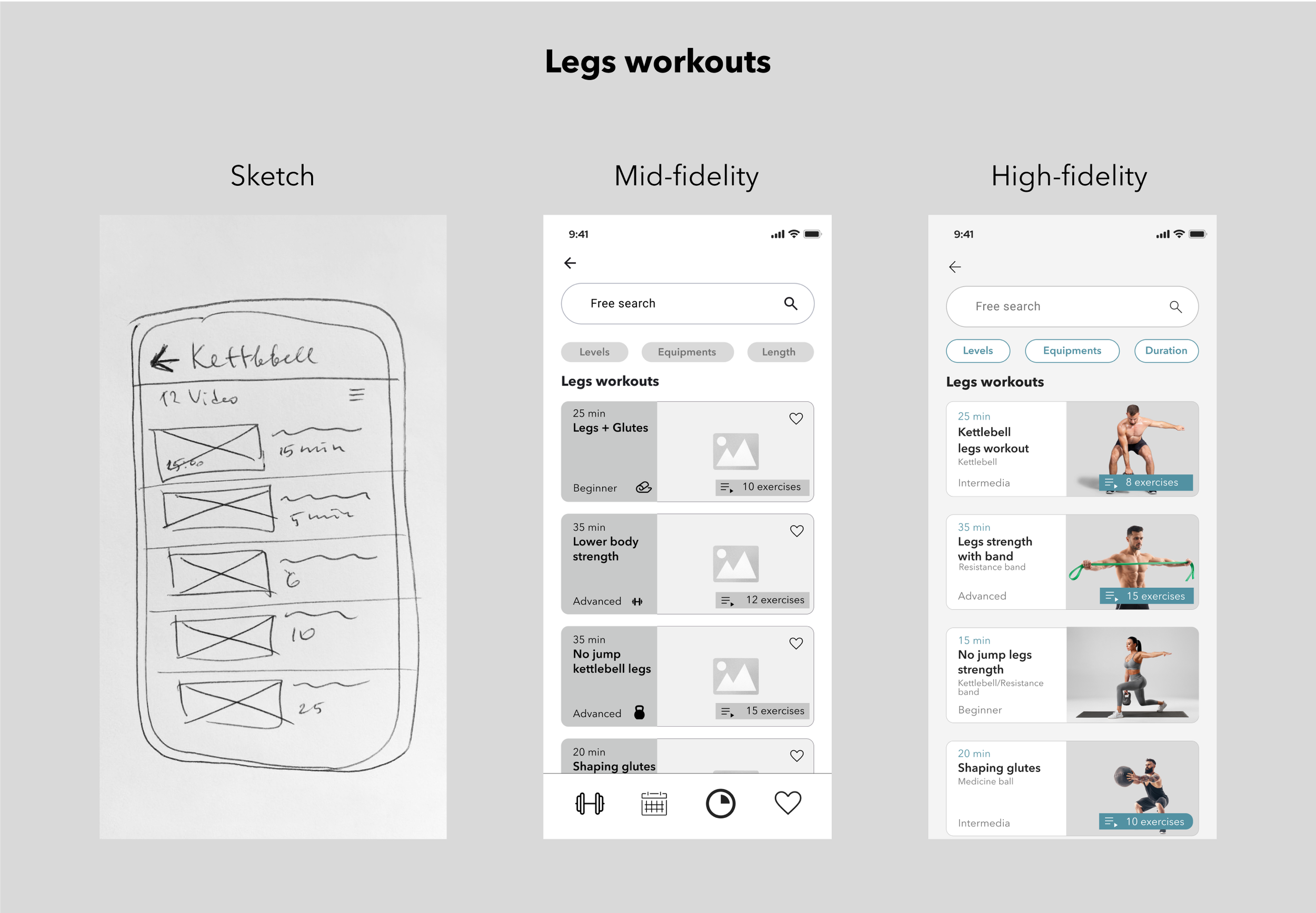
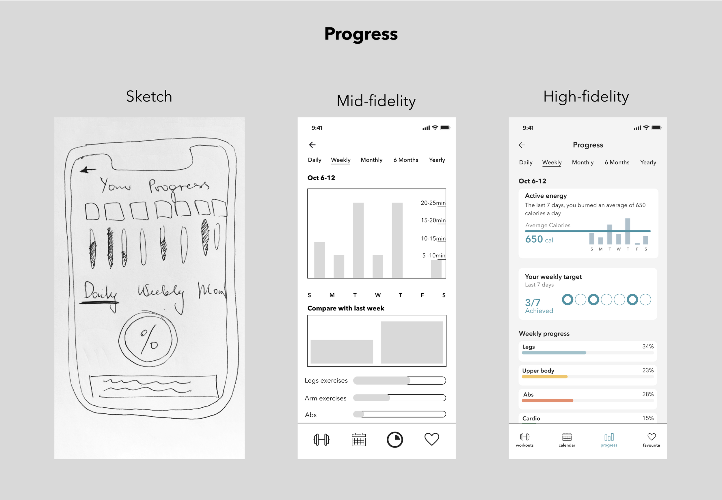
Responsive Wireframes
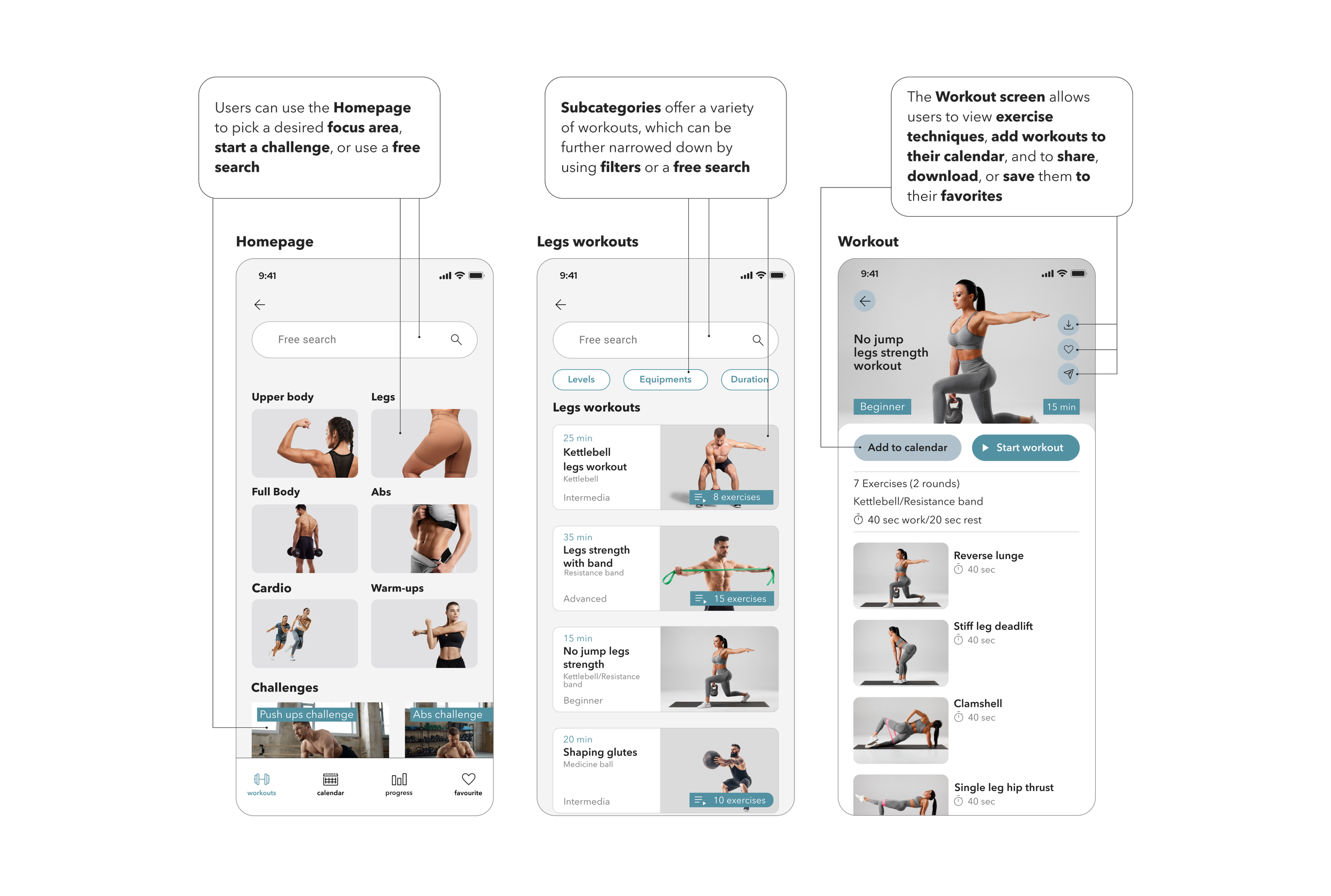
Creating the responsive wireframes for additional breakpoints was another remarkable learning experience. Adjusting layouts, navigation, media patterns and available content for different breakpoints was more challenging than I expected.
-
![]()
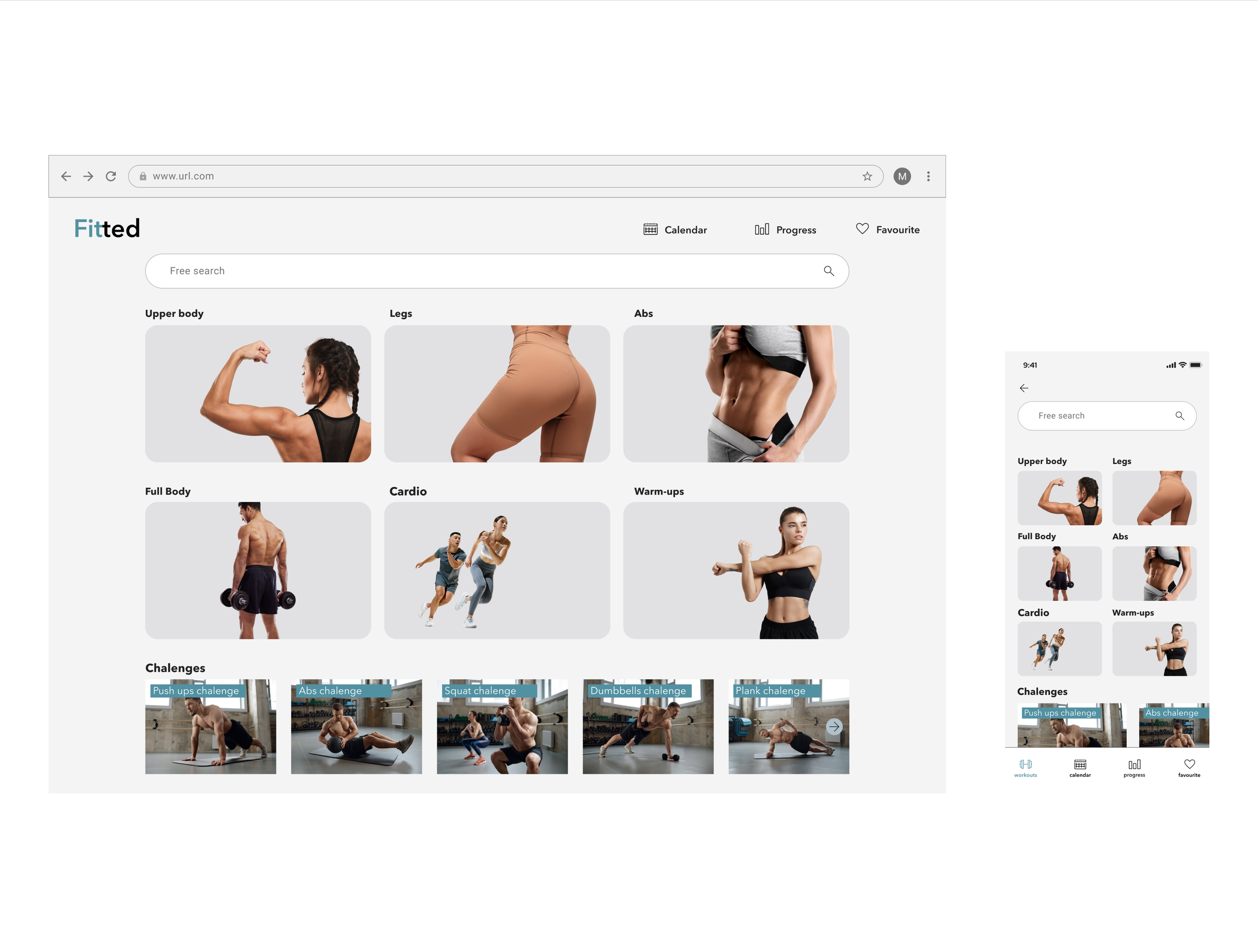
Homepage
-
![]()
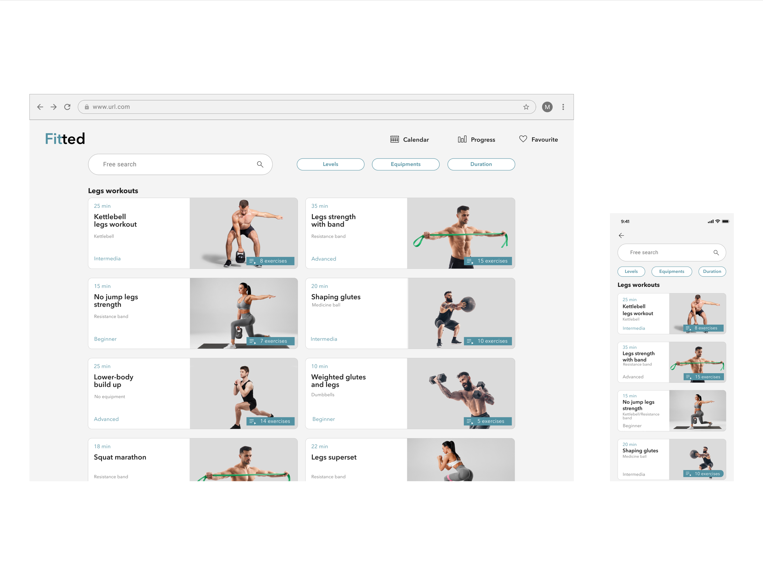
Leg workouts
-
![]()
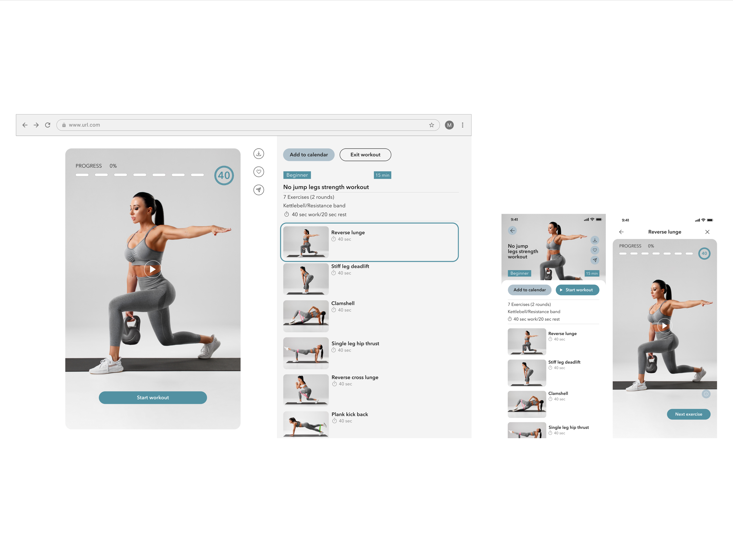
Workout
-
![]()
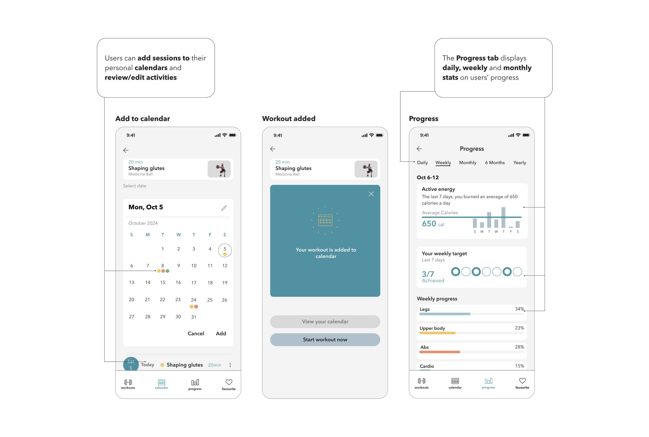
Add to calendar

Learnings
Working on this project was a lot of fun. I thoroughly enjoyed analyzing what needs, challenges, and motivations people with different fitness levels might face. As someone who has been exercising for many years and has been an active user of fitness platforms myself, I was curious to work on this project from the perspective of a UI designer.
One of my biggest challenges was finding the balance between aesthetics and usability and creating visually appealing interfaces that are intuitive and easy for users to navigate. I had to consider such criteria as visual hierarchy, brand consistency, and accessibility.
Another challenge was adapting the design for responsive breakpoints since it requires taking into consideration a wide range of screen sizes, orientations, and devices, and thus careful layout adjustments, content prioritization, and optimization to ensure a consistent and user-friendly experience across all platforms.