
My Therapist
Responsive Web App, UX/UI Design
Connecting people to professional family therapists

Context
We all need the advice of an expert sometimes. This app aims to give people a simple, intuitive way to connect with a professional family therapist so they can feel more informed and prepared to face their everyday problems.
Objective
Enable anyone who seeks expert guidance from qualified psychologists specializing in children and family issues to effectively navigate various behavioral situations with their kids.
Solution
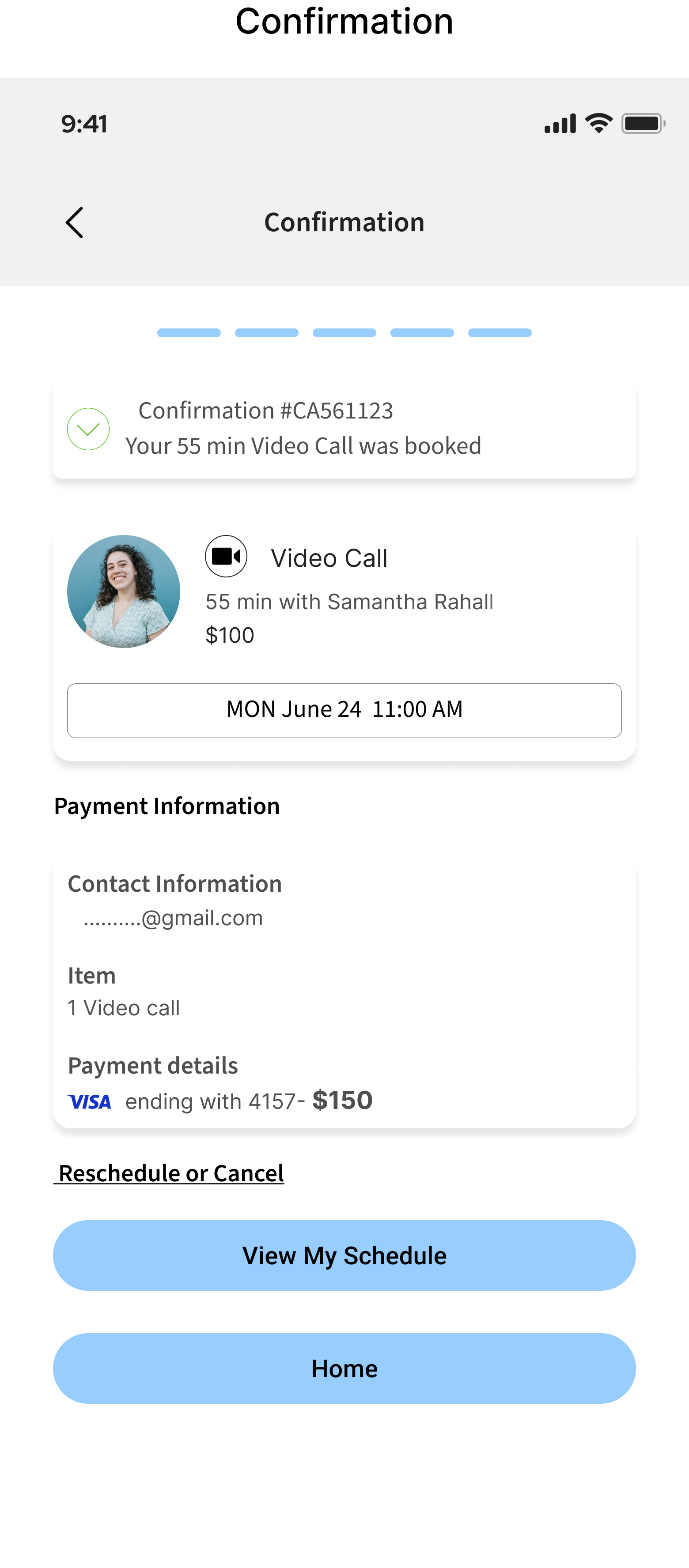
Designed a responsive web app with access to vetted and experienced family therapists who are available to help with a variety of mental health needs. Users can find the therapist through the matching algorithm or by browsing therapists’ profiles. The app also allows you to book, call, reschedule, and manage an appointment in one place.
Roles
UX/UI Design & Research
Duration
6 months
Methodology
User Research
Information Architecture
User Interface Design
Usability Testing
Research
First, I conducted a competitive analysis to get a better idea of the field and what’s already out there and then continued with user interviews to empathize with people’s needs, goals, pain points, and challenges around seeking psychological expert advice.
Defining Research Goals

My competitive analysis indicated that the competitors can be divided into two groups: The apps/websites like BetterHelp, TeenCounseling, ResilienceLab who hire therapists and work on a subscription/membership basis, paying experts the salary.

The second group includes platforms like META, B17.ru, Psychology today that use an aggregator business model: therapists provide services under the platform’s brand and pay commission on the clients’ sessions

User Interviews
My next step was conducting interviews. I invited 6 participants to represent two target audiences. Four of the participants are between 25 to 48 years old and are actively engaged in parenthood. They represent potential clients. Two participants are psychologists representing the second target audience – those who could provide their services on the platform.
Empathy Map

Main Users’ Pain Points

Define
Personas
To step further into the users’ shoes, I developed two personas that represent different target audience groups using my product.


At this step, I was ready to start defining the features my app would include. I had gotten to know my target users and had defined the key problems they were facing seeking family psychologist’s advice. So, I narrowed down the core features of my app - Onboarding page, Log in/Sign up, Book a Call, and Match with Therapist - and focused on designing those solutions first.
Book a Call Flow

Design
The feature started coming to life. I started with low-fidelity sketches focusing on the functionality, simplicity, and usability of Book a Call core feature, keeping in mind the Main Users’ Pain Points:
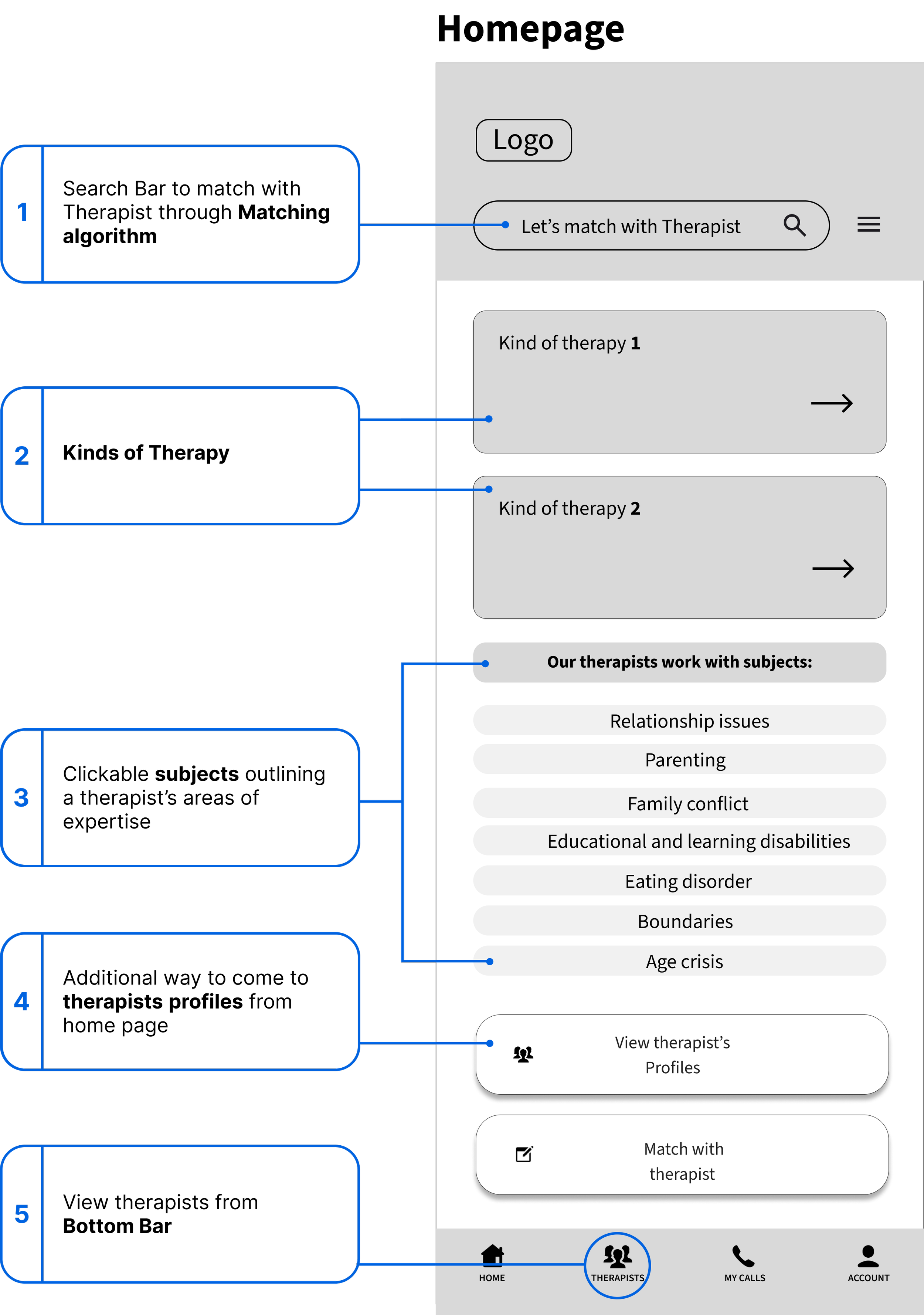
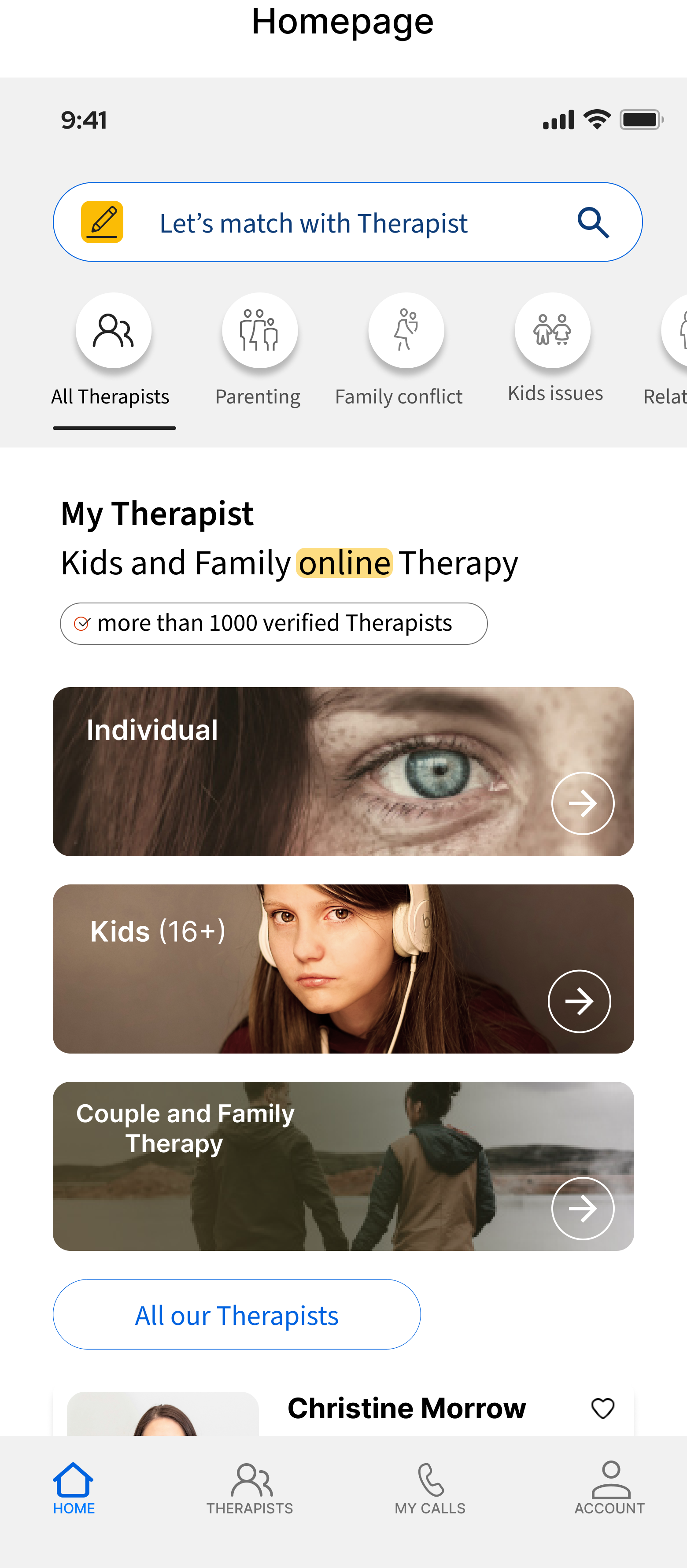
When developing the home screen, I tried to offer multiple ways to Get Started process and make them clear and visible to meet different users’ needs
Users can start searching for a therapist using any of the 5 ways:
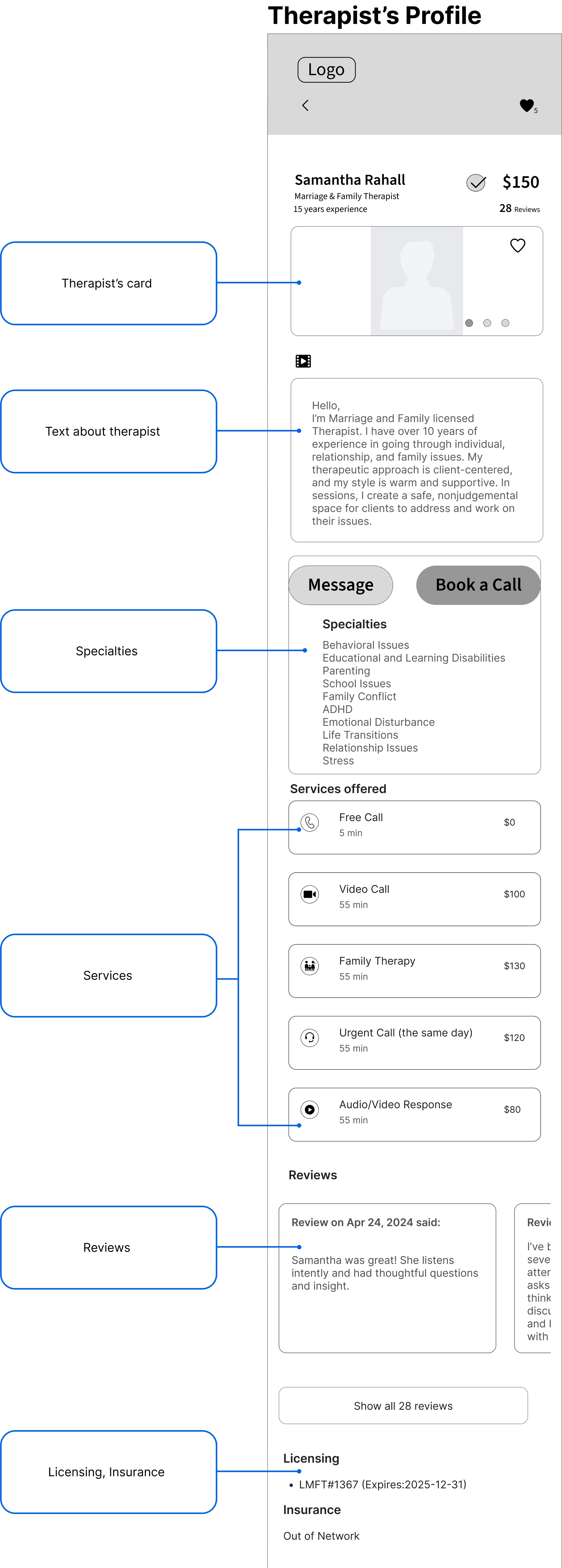
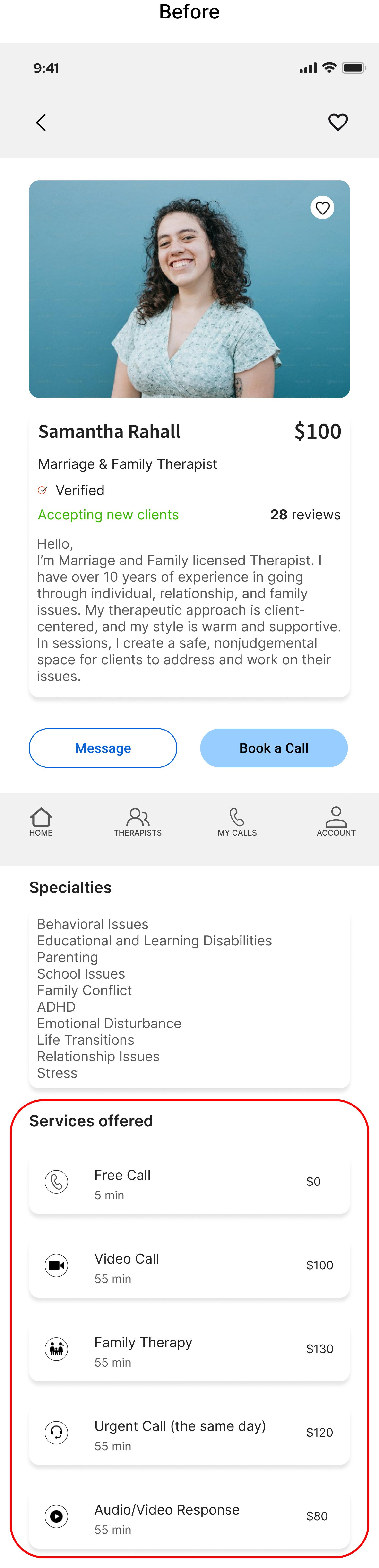
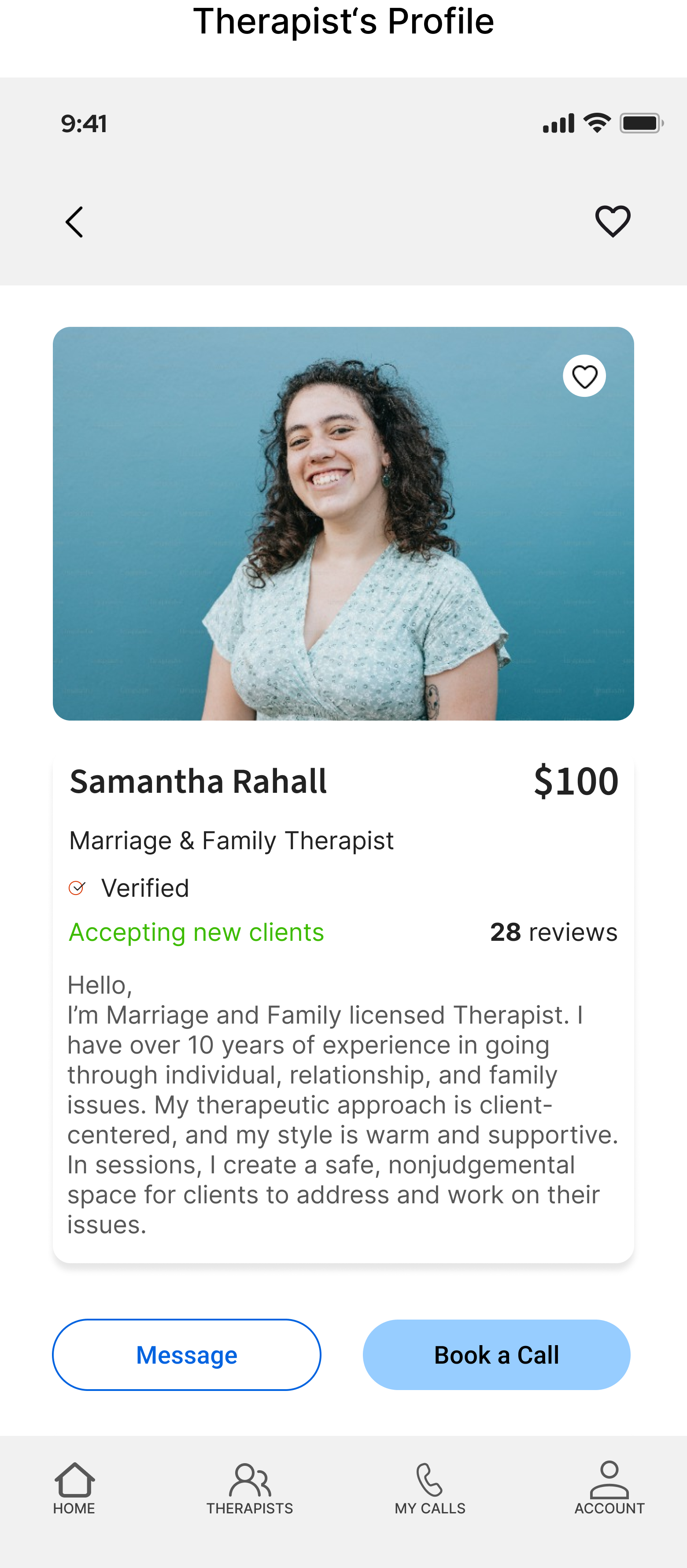
I tried to make a therapist’s profile clean, balanced and packed with all necessary information about them, their fees, times, services, availability, insurance acceptance, reviews, education and ways to communicate
Testing
To ensure my app met the needs of my target users, I created a prototype in Figma and set out to test it on 6 participants.

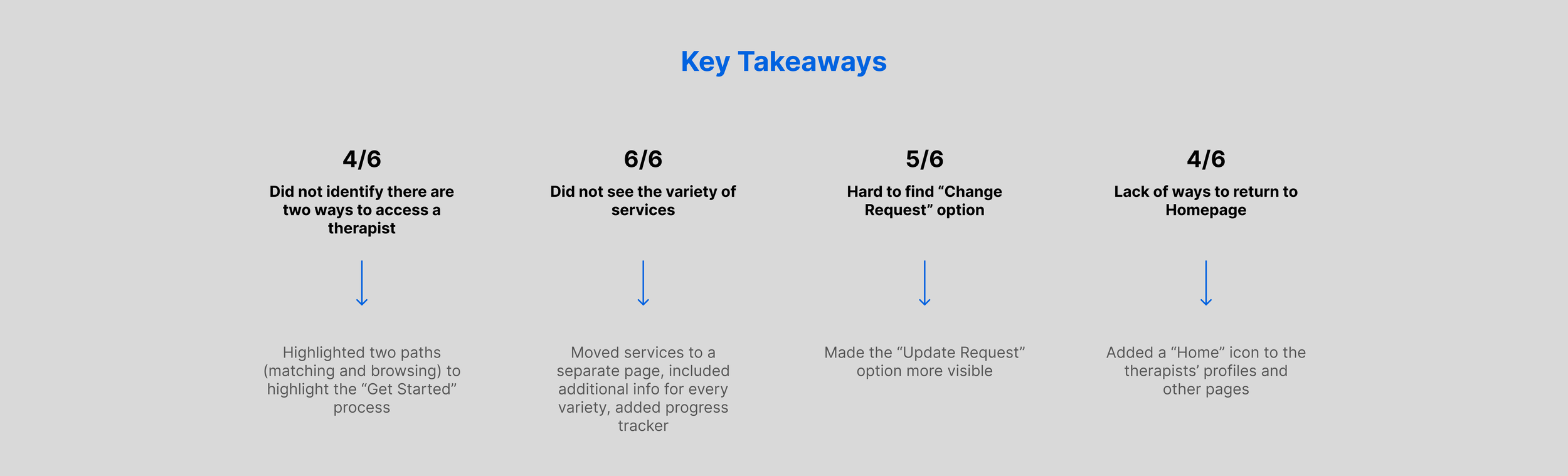
Resulting Revisions
Users didn’t get the idea of therapist access via 2 paths (matching and browsing)
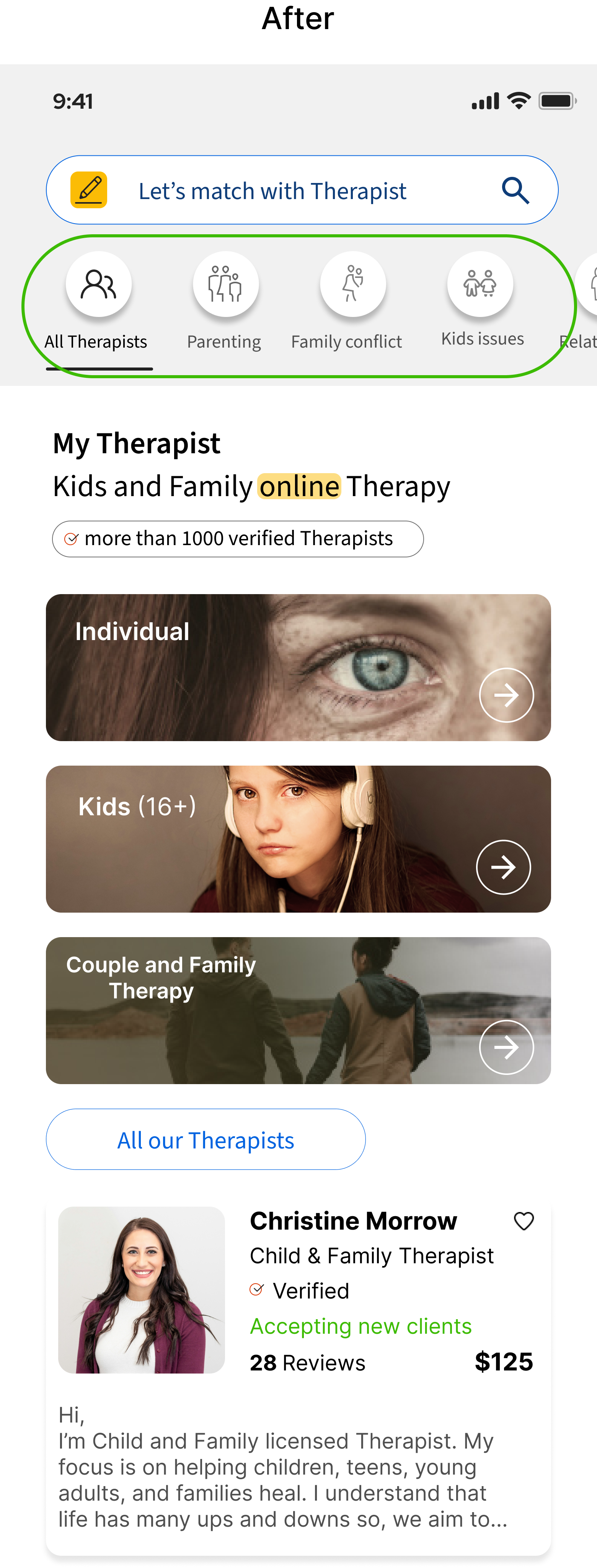
I changed “View Therapist Profile” for 3 additional ways to reach therapists’ profiles


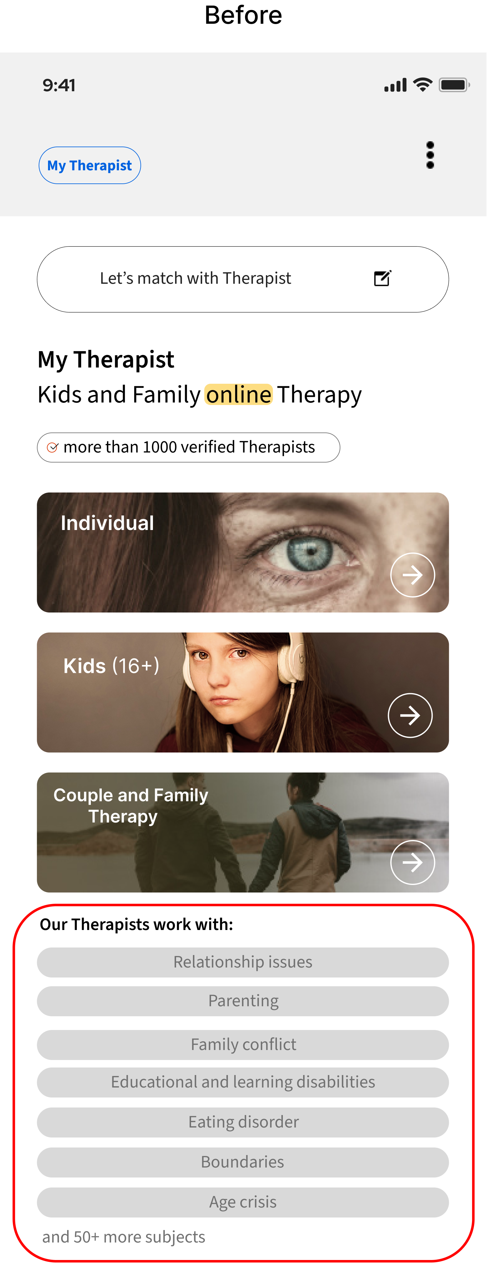
I rearranged the way to show subjects therapists work with and moved them to the top bar, creating an additional way to narrow down a therapy request
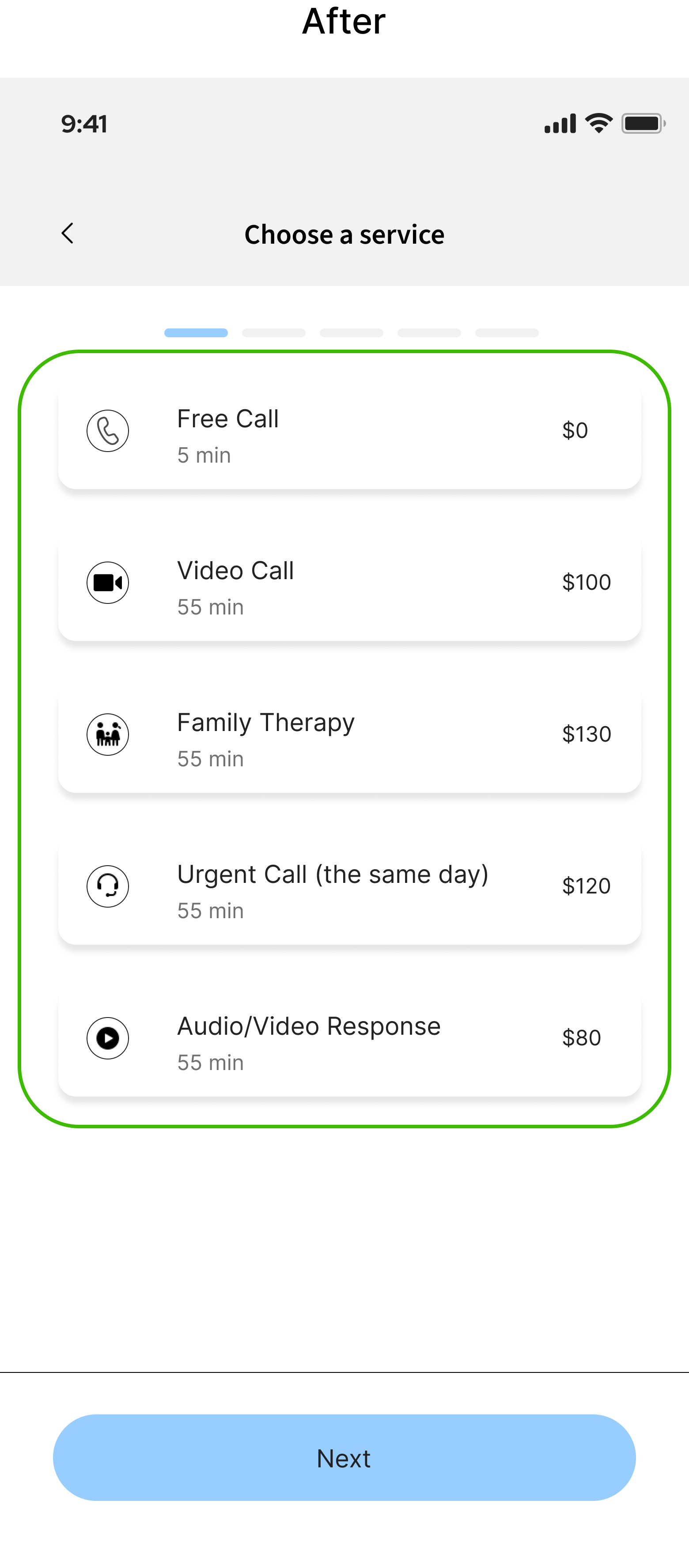
Users didn’t see the variety of services
I moved services to a separate page
The "Update request" option wasn’t obvious to the users, they were ready to start the matching process from the beginning, so I made a Call to Action button instead of an icon


Users struggled navigating back to Homepage or made too many clicks to reach it. I added the Home icon to the therapist’s profile and other pages where it was necessary


What about the Desktop version?
I started with “mobile-first” approach and then adapted most of the screens for both mobile and desktop, keeping in mind that My Therapist is a responsive web app. Here I take advantage of the larger screen real estate on desktop, which allows the layout to feel open and uncluttered


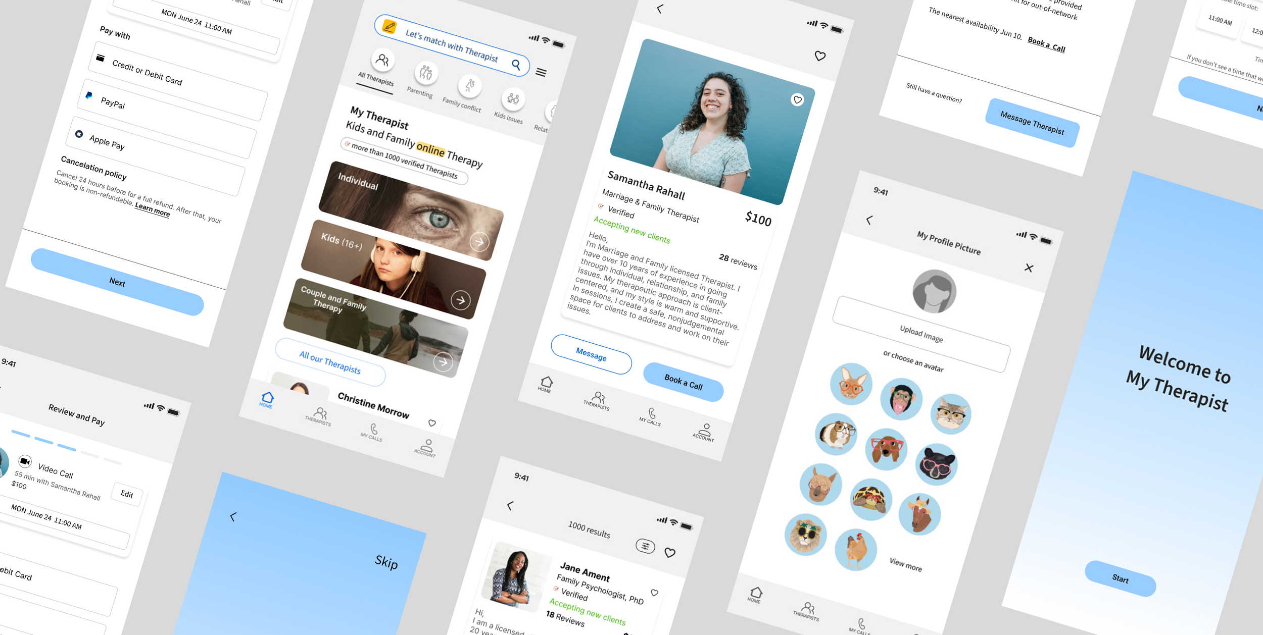
Final UI


Next Step
The next steps for My Therapist would definitely include further testing. I want to ensure the changes I made after the first usability testing do a better job of satisfying user needs. What works? What doesn’t? Could anything operate more smoothly?
The problem I’d like to solve next is how my application meets the therapists’ needs as a second user group. How do they create their profiles and manage communication with clients? Does the booking process work smoothly for both sides (client and therapist)? How can therapists post their availability? And does the current process of connecting to a session work – it currently allows to select, pay and confirm a call time, or is an additional step of “accepting a call” from a therapist is required? To confirm that, I need to carry out the MVP of the therapist’s flows by testing this prototype with potential users to see how it works and then introduce amends based on users’ feedback. New information will undoubtedly incur corrections to the existing product. The changes will be implemented and another round of testing will be held. I am also interested in introducing a journaling feature for the users to be able to share their diary notes.